
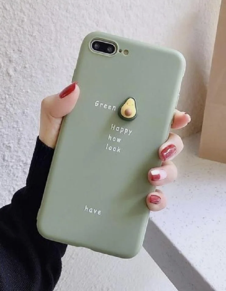
Starting with the “green” phone case adorned with an adorable avocado. This case likely aimed to convey a message of wellness and positivity with the phrase “Happy, how look have.” However, the jumble of words seems to have taken a detour through the blender. It’s a linguistic salad that serves a generous portion of confusion with a side of humor. It’s as if Yoda turned health guru and tried his hand at motivational speaking, reminding us that sometimes, in design, less is more and clarity is king.
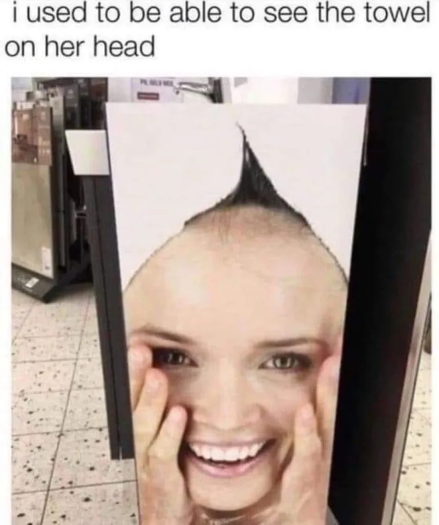
Now, take the signage fail that transforms an innocent towel ad into a punk rock statement. At first glance, we’re met with what appears to be a Mohawk-sporting model. However, it’s merely a towel masquerading as a hairdo, thanks to an unfortunate alignment with a partition. It’s a visual pun that inadvertently sells the idea that towels are the new trend in alternative hairstyles. This unintentional fusion of hygiene and hair fashion is a masterclass in checking how your ad interacts with its physical surroundings.
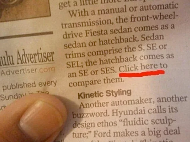
Let’s not overlook the newspaper snippet urging us to “Click here” on a printed page. It’s a digital call-to-action in an analog world, as if it’s beckoning us to embark on a futile quest of tapping our fingers on paper. This misplaced interactive element is a comical reminder that while integrating multimedia elements is the future, context is the compass that ensures those innovations navigate correctly.
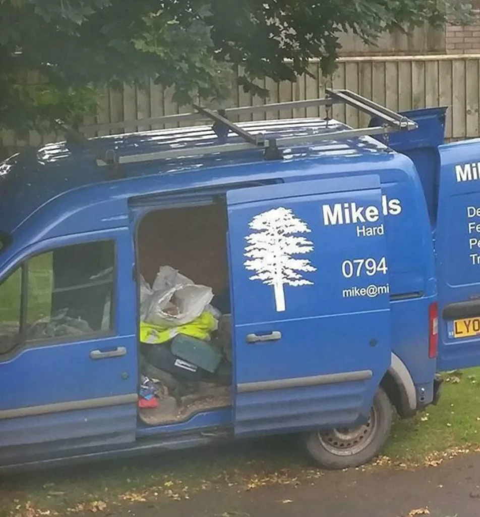
Moving on to the cluttered van that carries the slogan “Mike’s Hard.” The van’s open door reveals a scene of disarray, contradicting the promise of diligence and professionalism one might expect. It’s as if “Mike’s Hard” work is hiding behind a façade of chaos, humorously juxtaposing the expectation of orderliness with a visual symphony of entropy.
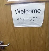
And then there’s the braille sign for “Welcome,” printed on a flat surface. It’s a well-intentioned gesture towards inclusivity that overlooks the fundamental principle of braille: it needs to be tactile. This sign is akin to a silent bell—nice to look at but functionally silent. It’s a poignant reminder that design must be empathetic, ensuring its purpose aligns with its utility.
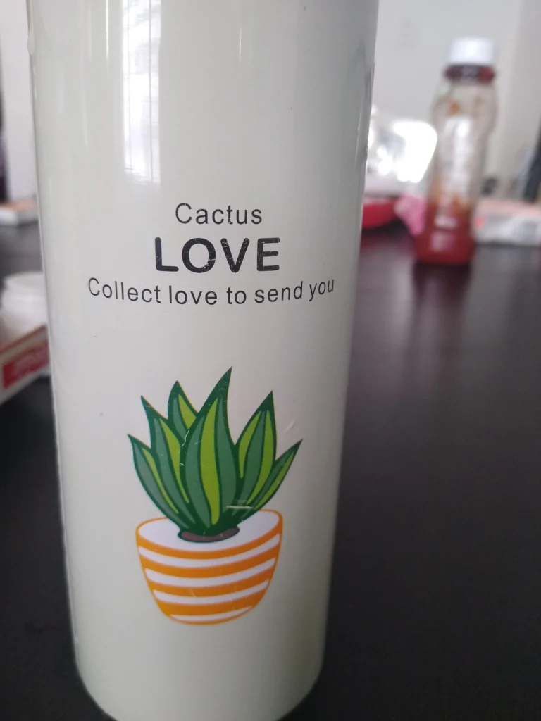
Onto the thermos with a sweet message, “Cactus LOVE Collect love to send you,” seemingly jumbled in translation. It’s as though the cactus, synonymous with prickliness, is attempting to rebrand itself as a messenger of love, yet gets lost in translation. This thermos treads the fine line between being endearingly sweet and inadvertently hilarious, reminding us that sometimes, words can be pricklier than a cactus when not arranged with care.
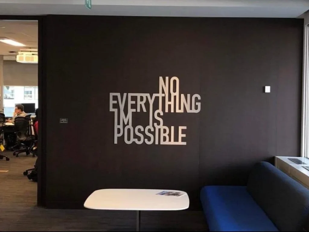
The office wall, declaring “NO EVERYTHING IS IM POSSIBLE,” aimed for inspiration but the spacing turned it into a negation of potential. It’s an ironic twist on a classic motivational quote, delivering a burst of unintended realism to every dreamer with its spacing debacle. It serves as a comedic reminder that in design, space is not just a frontier to be explored, but also one that can alter your message dramatically.
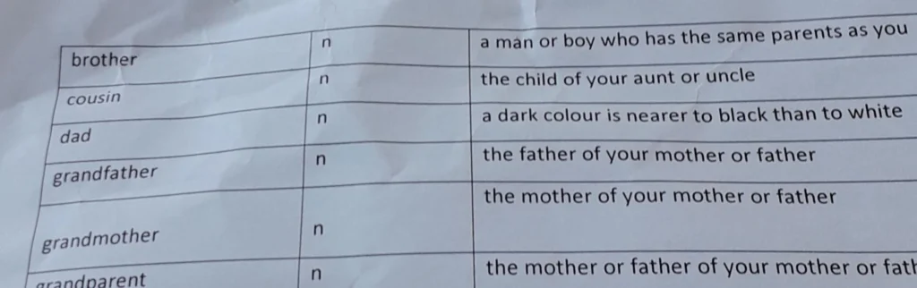
Now, let’s consider the perplexing family relationship chart. Here, darkness is humorously defined as a familial connection, leaving us to ponder the depths of our bonds with the color spectrum. It’s an endearing family tree that unexpectedly branches into abstract art, humorously illustrating that sometimes, even the simplest concepts can become comically complicated.
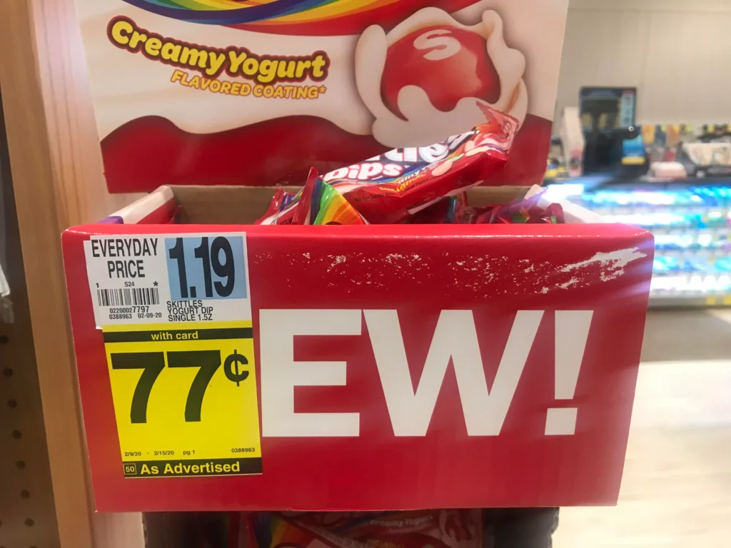
In the case of the Skittles sale sign, we’re confronted with a red sticker that exclaims “EW!” in large, disapproving letters. This unintended proclamation sits boldly atop a “Creamy Yogurt” sign, juxtaposing a marketer’s dream with a consumer’s candid reaction. The result? A candy-coated paradox that leaves us wondering if the yogurt’s taste is as shocking as its price. This is a sweet example of when the art of sales promotion goes hilariously sour, reminding us that placement is the secret ingredient in the recipe for advertising success.
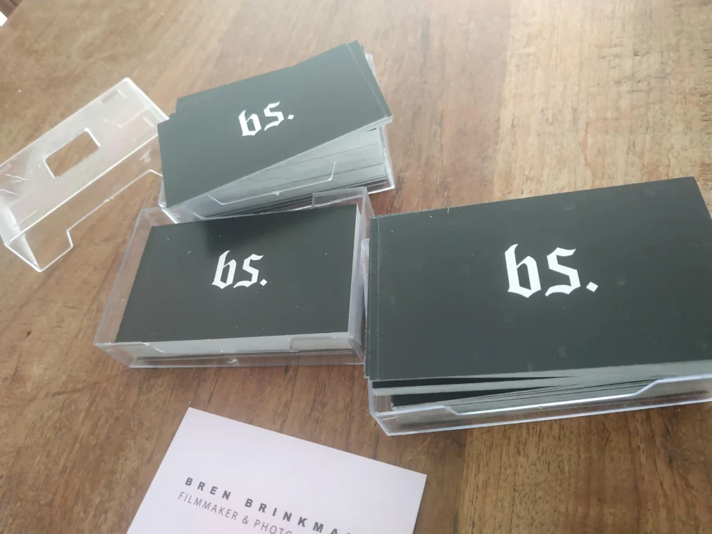
Business cards are meant to be the epitome of professionalism, a small cardstock extension of one’s brand. Here, we have a curious case of the disappearing act, where the brand’s name “bs.” seems to sink into a dark abyss, much like its chances of being remembered. With letters that play a game of hide and seek depending on the angle, it’s a quirky reminder that in design, contrast is not just an option; it’s a necessity. It’s a visual whisper that suggests, “Seek and ye shall find… perhaps.”
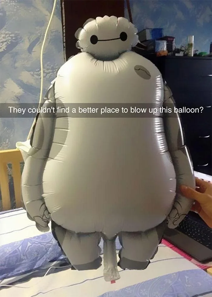
And who could overlook our inflated friend, the balloon with a… let’s call it an “unconventionally placed” inflation point? This design choice inflates our sense of humor more than the balloon itself. It seems to cry out for a rethink, or at least a relocation, of its very personal air intake. It’s an inflated reminder that sometimes, functionality should take a backseat to modesty, or at least to a more discreet placement.
The safety sign that shouts, “DON’T DIE,” followed by “Drive Safely,” could be seen as taking the direct approach a tad too seriously. The starkness of the message might just brake-check your heart rate before promoting road safety. It’s a jarring yet memorable roadside companion that makes sure you keep your eyes peeled – not just on the road, but on the profound life advice it offers.
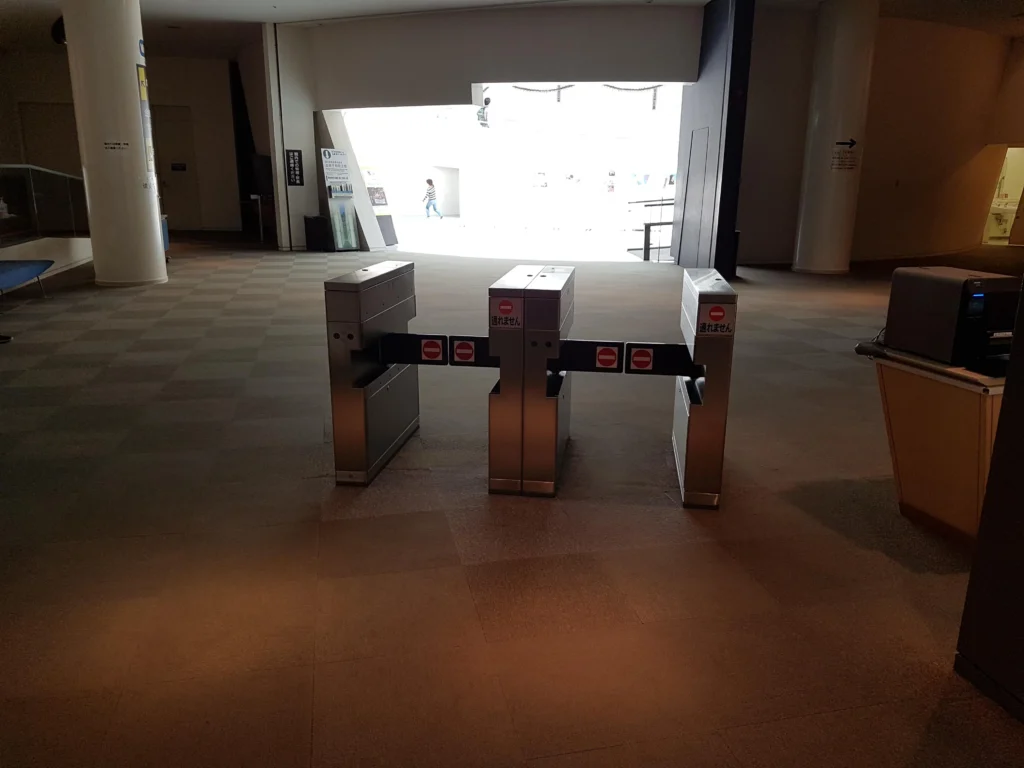
In the architectural ballet of space and restriction, we find turnstiles placed in what can only be described as a testament to human ingenuity, or perhaps oversight. These lonely guardians stand not as barriers but as modern art pieces, questioning the very nature of access and freedom. They are a silent ode to the paths less traveled and the turnstiles less turned.
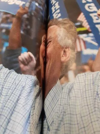
The magazine crease creating an optical illusion on a gentleman’s face is a delightful stumble into the world of unintentional cubism. The image, split across two pages, gives our unwitting subject a nose that Pinocchio would envy and a grin that defies anatomy. This serendipitous fold is a masterclass in accidental art, reminding us that sometimes, beauty—or comedy—is quite literally in the eye of the beholder.
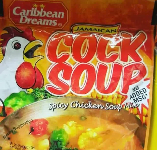
Next, we gaze upon a package of “Cock Soup,” a culinary name that’s bound to raise eyebrows and stifle giggles. This spicy chicken soup mix didn’t just miss the mark; it flew the coop of appropriateness. It’s a culinary misadventure that illustrates how crucial it is to consider all cultural and linguistic interpretations when branding, lest your product becomes the soup du joke.
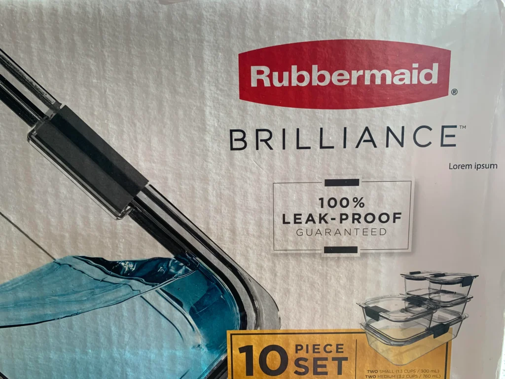
Then there’s the Rubbermaid packaging that confidently includes “Lorem ipsum” in its design. This classic placeholder text found its way into the limelight, offering a hearty spoonful of typographic soup with a side of “leak-proof” irony. It’s a silent nod to designers everywhere, reminding us to replace the filler text before it declares its nonsensical presence to the world.
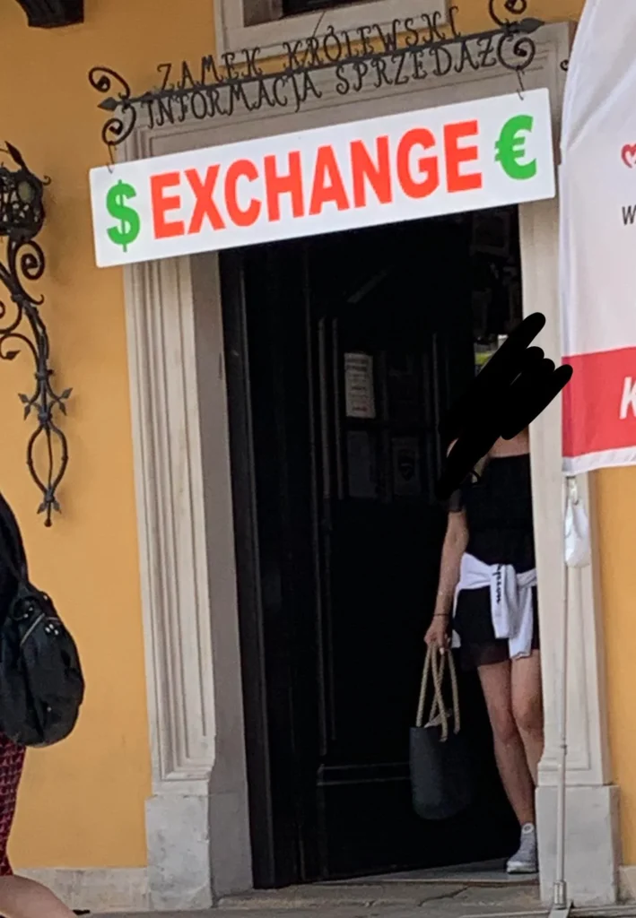
A currency exchange sign that’s as direct as a slapstick punchline, playfully announces “$EXCHANGE.” The dollar sign’s dalliance with the letter “E” is a flirtation that strays into the realm of unintended adult humor. It’s a classic case of typographical tomfoolery reminding us that spacing is not just a suggestion; it’s a mandate.
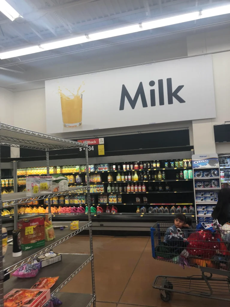
And what’s a comedy of errors without an aisle sign for milk crowned by an image of what seems to be orange juice? It’s as though the store decided to test our sensory perceptions, offering a ‘mix and match’ game for the thirsty shopper. It’s an amusing visual contradiction that milked the situation for all it’s worth.
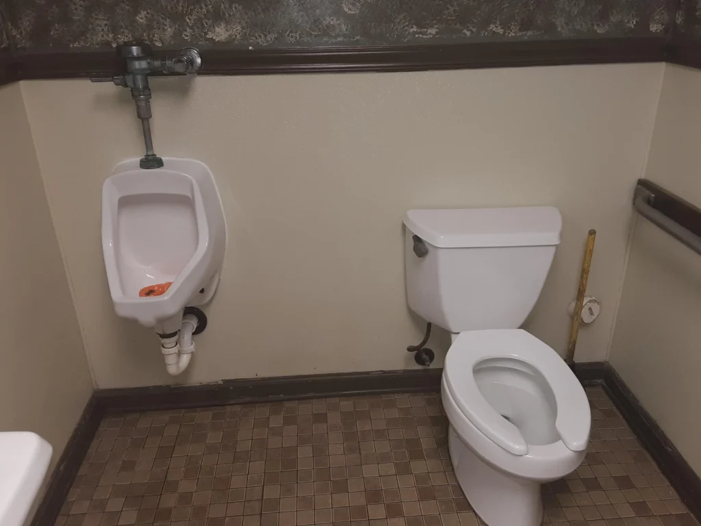
The toilet-urinal duo that stands so close, yet so functionally far, is a testament to personal space — or the lack thereof. It’s a puzzling proximity that would challenge even the most seasoned of bathroom users. This intimate arrangement is less about companionship and more about a crash course in awkward interactions.
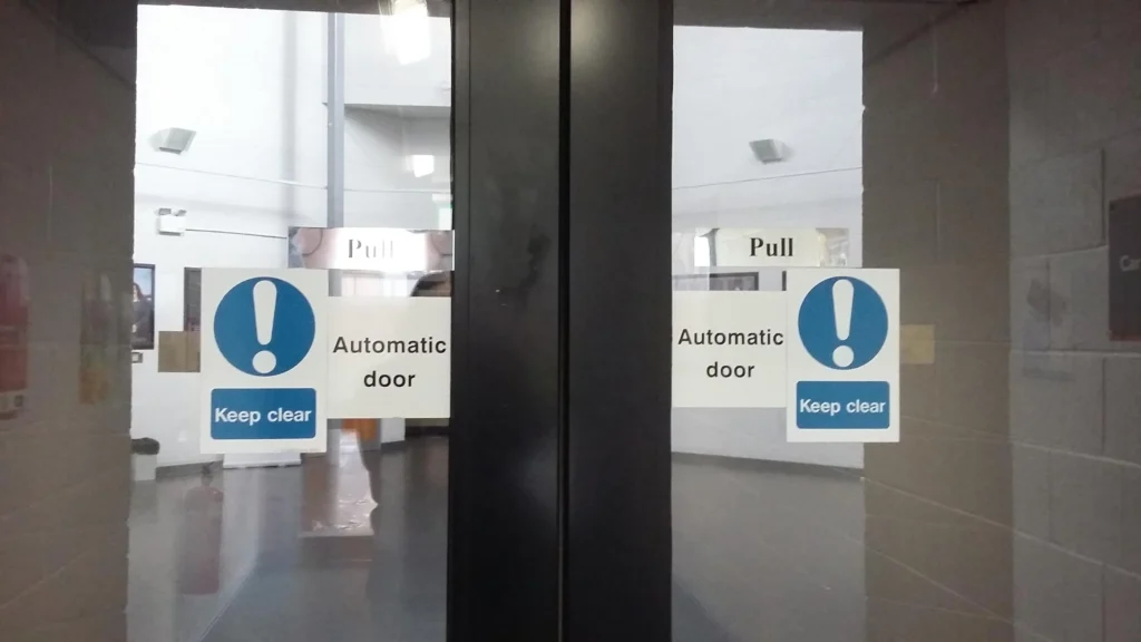
A door marked with signs for both automatic and manual operation creates a conundrum worthy of Schrödinger’s entryways. To push or not to push, that is the question. This door dances on the fine line between being helpfully informative and hilariously contradictory.
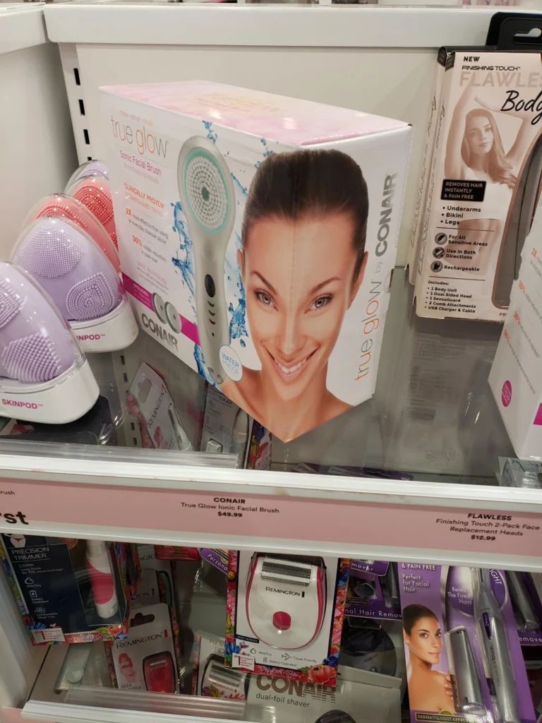
Then there’s the facial brush packaging that presents an alarming transformation. Caught mid-glow-up, the model on the box sports a design that would have Picasso nodding in approval. It’s a visual vortex where faces bend and beauty standards warp, reminding us that alignment is everything.
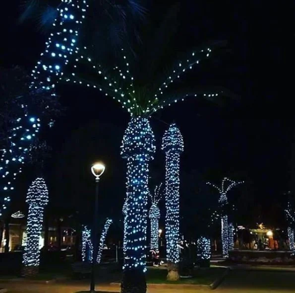
Lastly, we turn to the festive lights on palm trees that transform into… well, let’s just say, something rather cheeky. The lighting intended to celebrate and illuminate inadvertently ends up giving us the giggles. It’s a holiday decoration that went from ‘ho ho ho’ to ‘oh, oh, oh’ in a flicker.